
Early this week, my family and I stepped into a Tim Hortons together, probably the first time since last summer. Don’t get me wrong, we love coffee, we just prefer to brew it at home. We do go at Tim’s when we travel or are caught up running errands. But, it’s not on our daily route.
As we stood in line, I have noticed the glistening Touch Screen Kiosk, inviting us to order faster. I am not a fan of touchscreen kiosks, especially the parking kiosks and the ATMs. I am not particularly thrilled about the library self-help stations, either. What if you can’t see the screens? What if you need to feel some ridges to know where to press or some palpable arrows to be able to navigate the up-down-left-right of the screen?
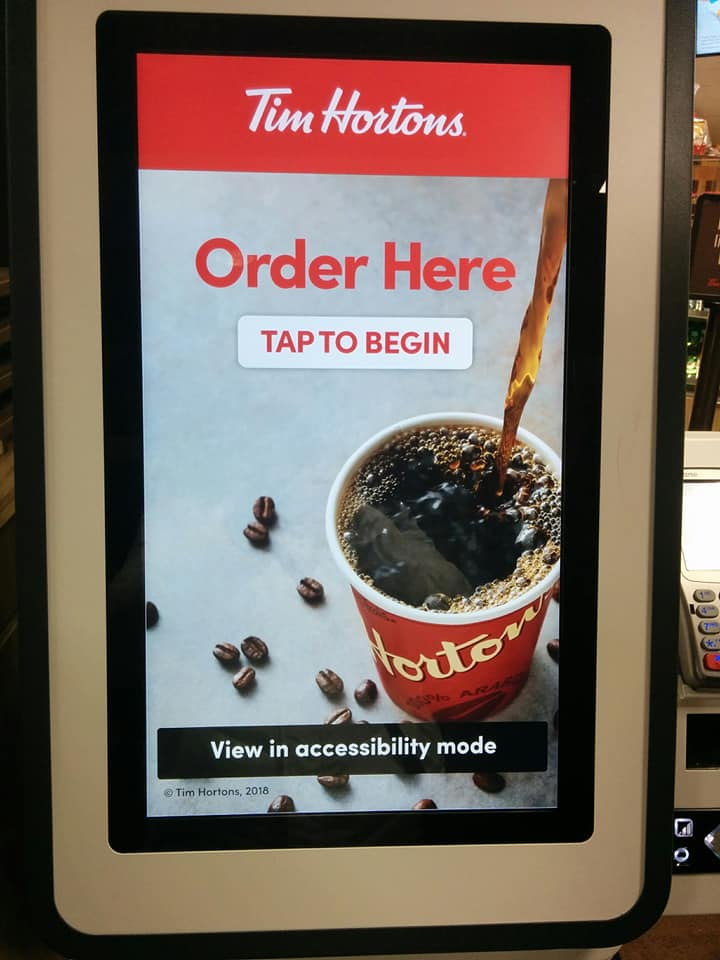
Touch-screen Kiosk with accessibility mode
Well… To my surprise, the Tim Hortons Kiosk had a big virtual button, saying: View in Accessible Mode. Oh, my curiosity was sparked in an instant. I wanted to know HOW do you make a touch-screen accessible.
So, I started pressing virtual buttons, trying to make sense of it. It took me a few minutes to understand it and at one point I did ask one of the employees, who didn’t quite get what I was asking. At first, she tried to show me how to use the kiosk. I said: “Yes, I get it, but here it says: view in accessibility mode, I want to understand what is accessible about this screen”. About 5 minutes and two supervisors later, I finally got it. Here we go:

This arrows pad makes the Kiosk Accessible to blind people
Under the numeric pad used to pay for your order, there is one more contraption. It consists of a smaller pad with arrows, a headphone jack (yay) and a volume button. Now, isn’t that smart?
I didn’t have any phones on me but, talking to my engineer husband, we could assume the following: a person who is blind or has low vision, can walk to the kiosk and find the phones jack and insert his/her headphones, signaling that someone needs to use the screen in accessibility mode. At that point, the kiosk starts talking. There is a button that allows you to adjust the volume. The arrow buttons have ridges that make it easy to navigate the screen.
The home screen is stripped of all the images of each of the products, but it now lists the menu, so the customer can select what he/she wants to buy.
What can I say! I was very impressed.
Today I went back, with my headphones, ready to test how accessible these terminals really are. Guess what! If it’s there it doesn’t really mean it works. Both Kiosks in my local Tim Hortons don’t work. I asked for the help of the Assistant Manager. I explained why I was interested. She said no one has ever used those.
But how could they have used those? Although there are some lit led lights under the arrows, they are unresponsive and so is the volume button. The Assistant Manager was gracious enough and promised to contact the kiosks provider to ask about how we turn the arrows on. I left my number and my email. We’ll see when I get an answer.
Well, I guess it’s a good start, Tim Hortons. Next step would be: make sure the accessibility mode can be accessed and used. Third step: train the employees, let them know, in case someone ever does want to use the kiosks and needs the accessibility feature. It’s been three months since these kiosks have been installed in my local Tim Hortons and yet, in two different days no one could really help me. Maybe it’s just this one coffee shop. Maybe it’s all over the place.
I don’t mean to say that people who are blind can’t have coffee at Timmie’s. They probably do and I do not presume to speak in their name. But, as an Ontarian, I would love to see that the Accessibility features that started to appear in our daily lives actually work.
Real Accessibility matters.